What Does Good UI/UX Actually Mean?
We spend hours using digital products every day. We order food, book tickets, make payments, shop online, check emails, manage work and scroll through more websites than we probably remember.
Some of those experiences just work.
You open the app, find what you need, get it done and move on. Others somehow turn a simple task into a five minute struggle. You can't find the button you're looking for.
The navigation doesn't make sense. A form asks for information that feels completely unnecessary. You click something and aren't sure whether anything happened. That's usually when we start noticing the design.
That's an interesting thing about UI/UX. When it's done well, you often don't notice it at all. You just use the product.
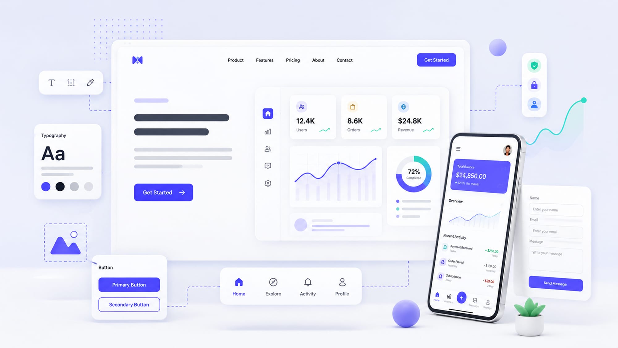
So, UI and UX... what's the difference?
These two terms get used together so often that they've almost become one phrase.
But they aren't the same thing.
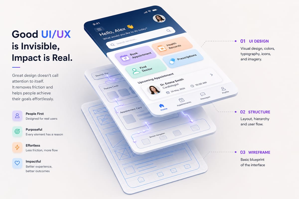
UI, User Interface, is the part you can see and interact with. Buttons, typography, colors, icons, cards, forms, menus, spacing all of that falls under UI.
UX, User Experience, is a little broader. It's about what happens while you're actually trying to use the product.
Here's an everyday example. Say you're booking an appointment with a doctor online. The color of the Book Appointment button, its size, and where it sits on the page are all UI decisions.
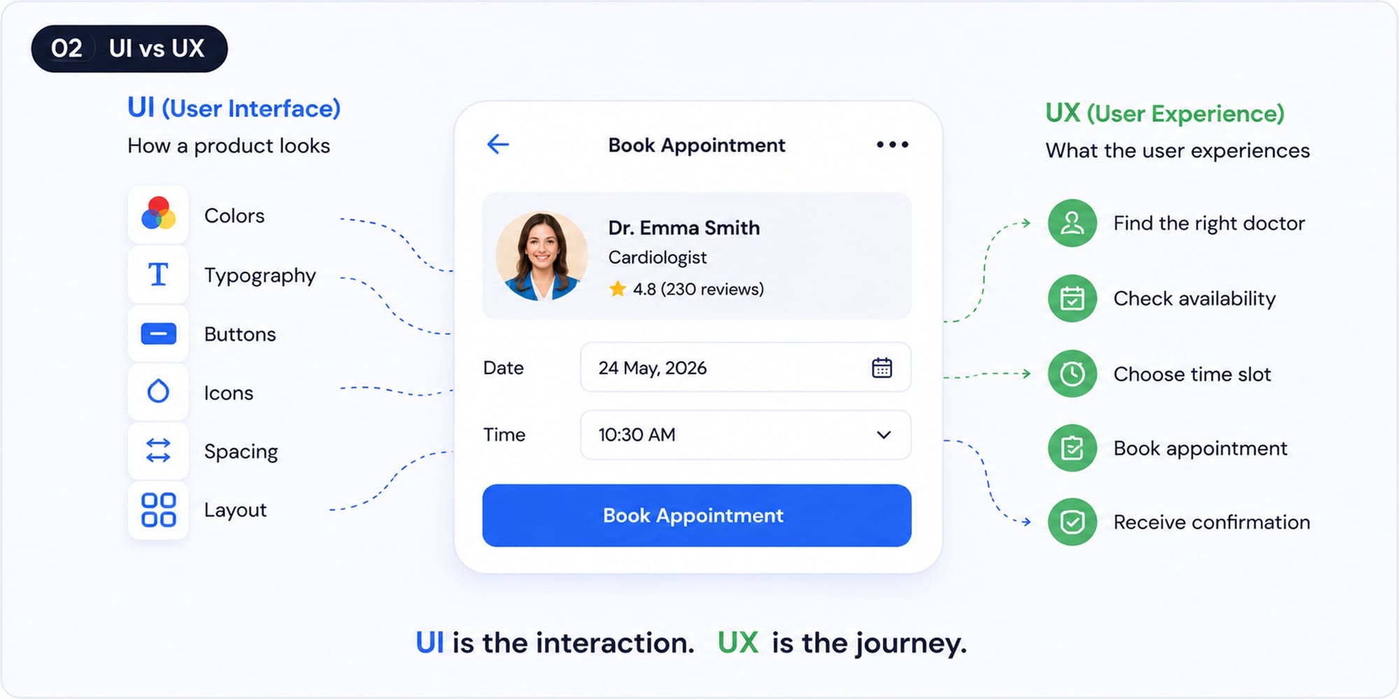
But think about everything you need to do around that button:
Can you easily find the right doctor?
Can you see which time slots are available?
Do you need to create an account before booking?
What happens after you confirm?
Do you receive a confirmation?
That's the experience. You can have a beautiful interface and still have a terrible booking process. The opposite is also true. Something can technically work but still feel outdated, inconsistent, or difficult to use.
The best products get both sides right.
You Shouldn't Have to Figure Out How a Website Works
Open a website you've never visited before. Within a few seconds, you should have a rough idea of where you are and what you can do. Nobody should need to explain: "Okay, first click this. Then open this menu. Ignore that button. Now scroll down."
Yet we've all used products that feel exactly like that. Sometimes the problem is surprisingly small.
Take a button that says: Submit. Submit what?
Compare that with: Book My Appointment.
Now you know exactly what's about to happen. It's a tiny change, but it removes one small moment of uncertainty. Those small moments add up.
Not Everything on the Screen Can Be Important
This is something we see quite often when designing websites. Everyone involved in the project has something they want users to notice:
- The marketing team wants the offer to stand out.
- The sales team wants Book a Demo to stand out.
- Someone wants the new feature promoted.
- Someone else wants the newsletter highlighted.
- Then there's the chatbot.
And suddenly, the homepage has six things shouting for attention. The problem isn't that any one of those things is bad. The problem is that users don't know where to look.

A strong interface makes choices on behalf of the user:
- This is the main message.
- This is the primary action.
- This information is useful, but it can come later.
That hierarchy is what makes a page feel calm and easy to scan. You don't necessarily need less content. You need clearer priorities.
Every Extra Step Has a Cost
Let's say you've downloaded a new app because you want to try one specific feature.
You open it.
Create an account.
Verify your email.
Come back.
Complete your profile.
Choose your interests.
Set your preferences.
Choose a plan.
And finally you reach the feature you originally came for.
By that point, some people have already left. This is where UX goes far beyond colors and buttons.
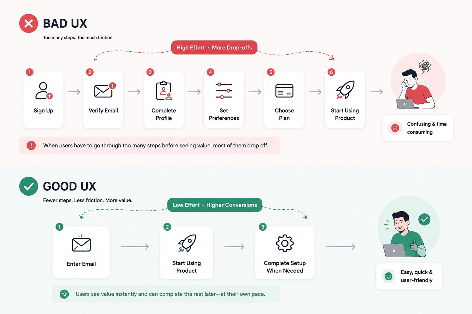
Every screen, click, and decision between the user and their goal creates some amount of friction.
Sometimes it's necessary. A banking product obviously needs more verification than a weather app. But every step should still earn its place. One question we like to ask when looking at a user flow is: "Do we really need the user to do this right now?"
If the answer is no, maybe that step can happen later. Or perhaps it doesn't need to exist at all.
Silence From an Interface Is Surprisingly Frustrating
You click Save. Nothing happens. You click it again. Still nothing. Now you're not sure whether it saved twice, didn't save at all, or the page is simply slow.
A tiny piece of feedback would solve the entire problem. Saving...followed by:
✓ Changes saved.
That's it. The same applies everywhere.
- Uploading a file? Show the progress.
- Placing an order? Confirm it.
- Processing a payment? Tell the user.
- Something failed? Explain what happened.
Interfaces should feel like they're responding to you. When they don't, people start second-guessing their actions.
People Are Going to Make Mistakes
No matter how carefully you design something, users will eventually do something unexpected. They'll mistype their email address. Forget a required field. Upload the wrong document. Press the wrong button.
That's normal. The experience shouldn't fall apart because of it.
There's a big difference between:
"Error 402: Invalid request."
and:
"We couldn't process your payment. Your card hasn't been charged. Please try again or use another payment method."
One leaves you wondering what happened. The other tells you exactly where you stand and what you can do next. That's good UX too. It's not only about helping people move forward when everything goes right. It's also about helping them recover when something goes wrong.
Consistency Sounds Boring. It's Actually Incredibly Useful.
Imagine if the brake pedal moved every time you got into a different car. You'd eventually figure it out, but you'd have to think about something that normally requires no thought at all.
Digital products work in a similar way. If buttons, icons, navigation, and forms behave consistently, users start building familiarity. They don't need to relearn the interface on every screen.
This is also why design systems matter. A design system isn't just a beautifully organized Figma page full of buttons and color tokens. It gives the product a shared language. Designers know how components should look. Developers know how they should behave. And users get an experience that feels like one product rather than twenty screens designed independently.
Responsive Doesn't Automatically Mean Mobile Friendly
This distinction matters. You can make a desktop website technically fit inside a 390 pixel wide screen and call it responsive. That doesn't mean it's pleasant to use.
Maybe the buttons are too small.
Maybe there's too much information.
Maybe a form designed for a large monitor takes forever to complete on a phone.
Maybe a pop-up covers half the screen.
Instead of asking: "How do we make this desktop screen fit on mobile?"it can be much more useful to ask: "What is someone likely trying to do here from their phone?"
Maybe a desktop customer wants to explore every feature. A mobile visitor might just want to call you. Those are different needs, and the design should recognize that.
Accessibility Isn't Something to Add at the End
Readable text. Good contrast. Clear labels. Keyboard navigation. Visible focus states. Comfortable touch targets.
These are often discussed under accessibility, but look at that list again. Almost everything there also makes the product easier to use in general. Good contrast helps someone with low vision, but it also helps someone looking at their phone outside on a sunny afternoon. Large touch targets help people with motor impairments, but they also help someone trying to use a phone with one hand
Accessibility isn't a separate layer sitting on top of UX. It's part of designing an experience that works for real people in real situations.
Does That Mean Everything Needs to Look Simple?
Not at all. This is where discussions about usability sometimes go too far. A usable website doesn't have to be white, minimal, and boring.
Visual personality matters. Typography can have character. Colors can be bold. Animation can make interactions feel alive. Illustrations can help tell a story.
The question isn't: "Is this decorative?"It's: "Is this getting in the user's way?"
A beautiful animation that helps communicate an idea can improve the experience. A beautiful animation that makes someone wait five seconds before they can read the page probably isn't helping. You can absolutely create something distinctive without making it difficult to use.
So, What Does Good UI/UX Actually Look Like?
There's no screenshot we can point to and say, "This is what every good interface should look like."Context matters too much. A banking platform and a fashion store shouldn't feel identical. Neither should a children's learning app and an enterprise analytics dashboard.
But the underlying principles are surprisingly consistent. A strong experience is usually:
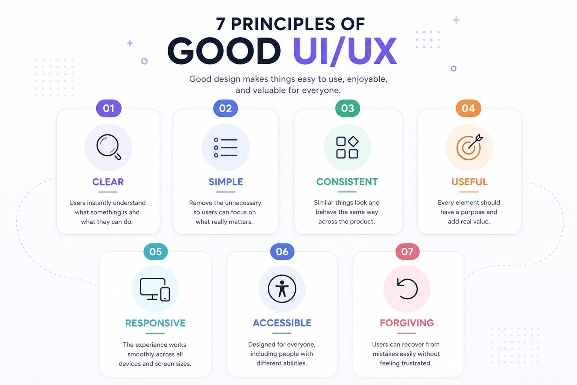
Clear: You understand what's happening.
Simple: Unnecessary complexity has been removed.
Consistent: Things behave the way you expect them to.
Useful: Elements exist for a reason
Responsive: The experience works comfortably across devices.
Accessible: More people can actually use it.
Forgiving: Making a mistake doesn't leave you stuck.
You could probably add dozens of design principles to that list. But if those seven are working, you've already solved a lot.
Why Does Any of This Matter to a Business?
Because users don't think: "The UX of this company's checkout flow is inefficient."They think: "Buying from this company is annoying."
They don't think: "The information architecture of this website needs improvement."They think: "I can't find what I'm looking for."
That's the important part. People experience the interface, but they associate that experience with the business behind it.
If your website makes things easy, your company can feel easier to work with.
If information is clear, your company can feel more transparent.
If everything works smoothly, the business feels more professional.
UI/UX isn't going to rescue a bad product or a bad business. But poor UX can absolutely make a good product harder to use, harder to understand, and harder to trust.
Maybe the Best Design Isn't the One People Notice
Designers naturally want to create things people remember. There's nothing wrong with that. But when we're designing a product, sometimes the better compliment isn't: "This looks amazing."
It's: "That was easy."
The user found what they needed. They knew what to do. Nothing confused them. Nothing got in their way. They finished what they came to do and moved on.
It doesn't sound particularly dramatic. But that's often exactly what good UI/UX looks like.