Flex Property in CSS

The flex property sets the flexible length on flexible items. A flex container expands items to fill available free space or shrinks them to prevent overflow.
Basics and terminology:
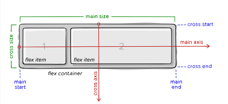
- main axis – The main axis of a flex container is the primary axis along which flex items are laid out. Beware, it is not necessarily horizontal; it depends on the
flex-directionproperty (see below). - main-start | main-end – The flex items are placed within the container starting from main-start and going to main-end.
- main size – A flex item’s width or height, whichever is in the main dimension, is the item’s main size. The flex item’s main size property is either the ‘width’ or ‘height’ property, whichever is in the main dimension.
- cross axis – The axis perpendicular to the main axis is called the cross axis. Its direction depends on the main axis direction.
- cross-start | cross-end – Flex lines are filled with items and placed into the container starting on the cross-start side of the flex container and going toward the cross-end side.
- cross size – The width or height of a flex item, whichever is in the cross dimension, is the item’s cross size. The cross size property is whichever of ‘width’ or ‘height’ that is in the cross dimension.
Flexbox properties:
flex-direction:
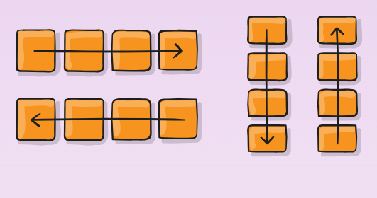
This establishes the main-axis, thus defining the direction flex items are placed in the flex container.
.container {
  flex-direction: row | row-reverse | column | column-reverse;
}
flex-grow
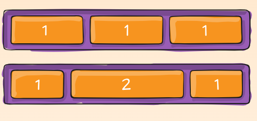
This defines the ability for a flex item to grow if necessary. It accepts a unitless value that serves as a proportion.
.item {
  flex-grow: 4; /* default 0 */
}
flex-wrap
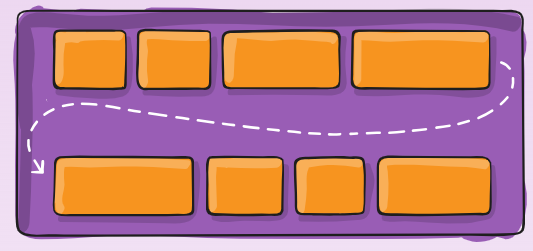
By default, flex items will all try to fit onto one line.
.container {
  flex-wrap: nowrap | wrap | wrap-reverse;
}
flex-shrink:
This defines the ability for a flex item to shrink if necessary
.item {
  flex-shrink: 3; /* default 1 */
}
flex-flow
This is a shorthand for the flex-direction and flex-wrap properties, which together define the flex container’s main and cross axes.
.container {
  flex-flow: column wrap;
}
flex-basis
This defines the default size of an element before the remaining space is distributed.
.item {
  flex-basis:  | auto; /* default auto */
}
flex
This is the shorthand for flex-grow, flex-shrink and flex-basis combined.
.item {
  flex: none | [ <'flex-grow'> <'flex-shrink'>? || <'flex-basis'> ]
}
justify-content
This defines the alignment along the main axis. It helps distribute extra free space leftover when either all the flex items on a line are inflexible, or are flexible but have reached their maximum size.
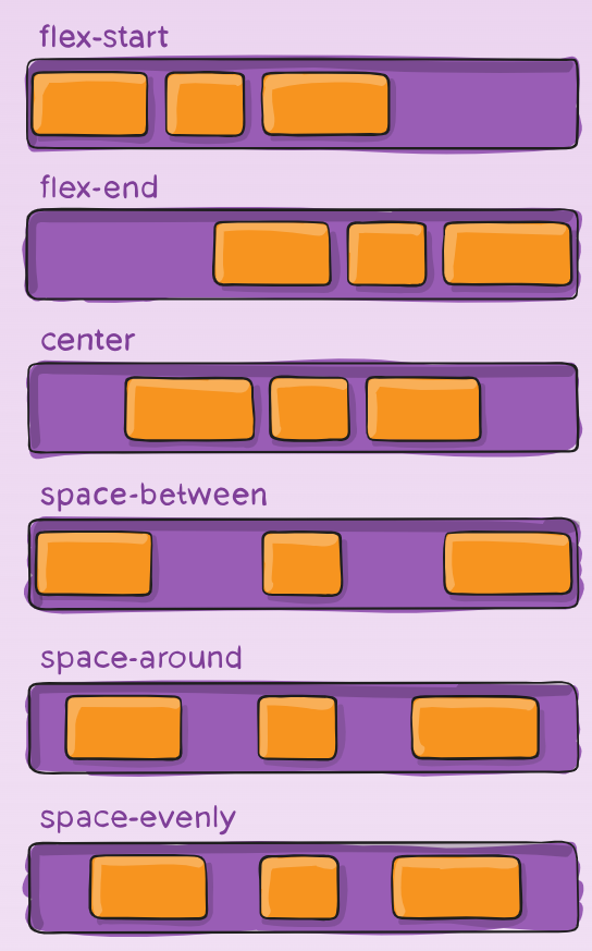
.container {
  justify-content: flex-start | flex-end | center | space-between | space-around | space-evenly | start | end | left | right ... + safe | unsafe;
}
align-self
This allows the default alignment (or the one specified by align-items) to be overridden for individual flex items.
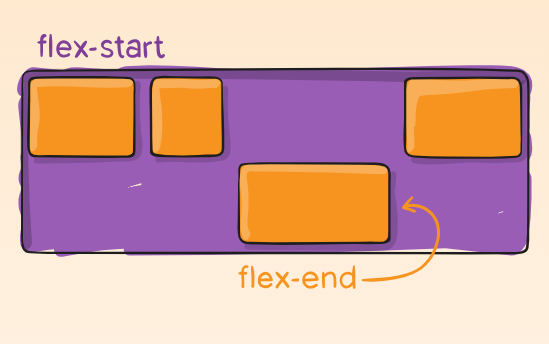
.item {
  align-self: auto | flex-start | flex-end | center | baseline | stretch;
}
align-items
This defines the default behavior for how flex items are laid out along the cross axis on the current line.
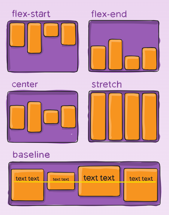
.container {
  align-items: stretch | flex-start | flex-end | center | baseline | first baseline | last baseline | start | end | self-start | self-end + ... safe | unsafe;
}
align-content
This aligns a flex container’s lines within when there is extra space in the cross-axis, similar to how justify-content aligns individual items within the main-axis.
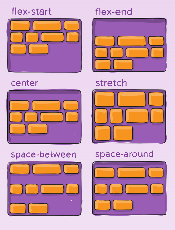
.container {
  align-content: flex-start | flex-end | center | space-between | space-around | space-evenly | stretch | start | end | baseline | first baseline | last baseline + ... safe | unsafe;
}
gap, row-gap, column-gap
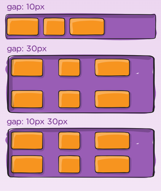
The gap property explicitly controls the space between flex items. It applies that spacing only between items not on the outer edges.
.container {
  display: flex;
  ...
  gap: 10px;
  gap: 10px 20px; /* row-gap column gap */
  row-gap: 10px;
  column-gap: 20px;
}

